Work on your Devtool Money Shot
The 1 visual that makes up what 99% of people remember about you: Make it count.

Per Wikipedia:
a money shot is a moving or stationary visual element of a film, video, television broadcast, or print publication that is disproportionately expensive to produce or is perceived as essential to the overall importance or revenue-generating potential of the work.
You've seen them in movies:

But they are less discussed in devtools. Let's fix that.
Devtool money shots are the one visual that explains your product or message or story. They are the infographic that maps out a worldview for an industry, the heavily researched chart that is sent to coworkers to prove a point, the slide that makes your audience members pull out their phones and snap a photo while you give a talk. The visual that industry insiders simply refer to by name and everyone nods because they've all seen it.
Money shots have a wildly disproportionate impact to your messaging. You might speak or publish 100,000 words in a year, but the 10 words on your money shot might make up what 90% of your audience remembers about you.
It stands to reason that you should invest accordingly — with the caveat that overdesigning a visual can decrease its "moneyness", and a tiny amount of imperfection is charming.
What follows is a simple, nonexhaustive taxonomy of money shots from my experience. Please suggest others!
Types of Money Shots
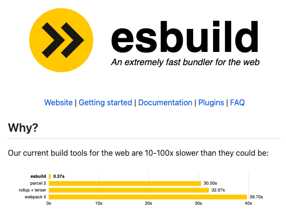
The Benchmark
The Abstract Thesis
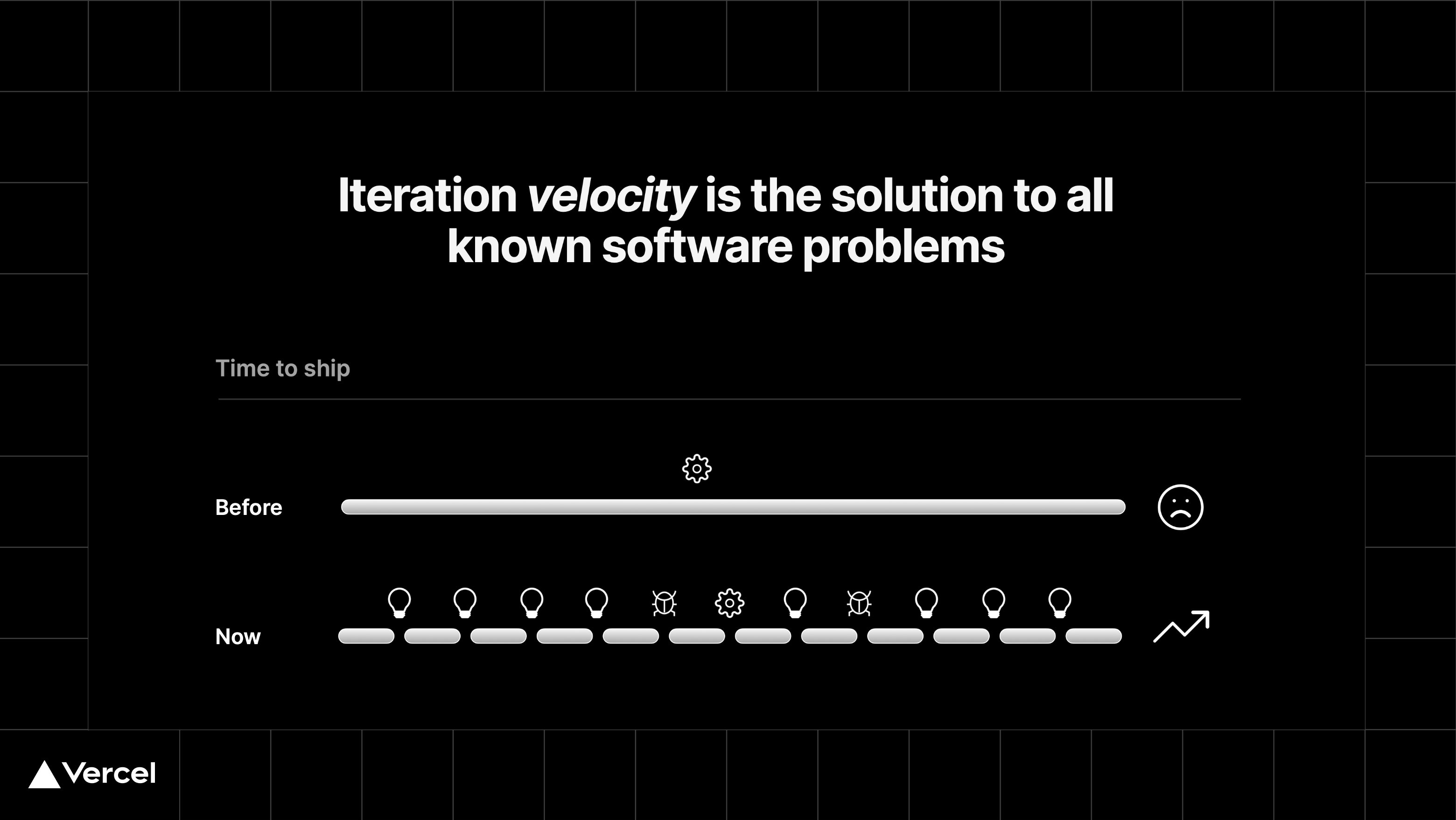
Jack Butcher is particularly good at this one.
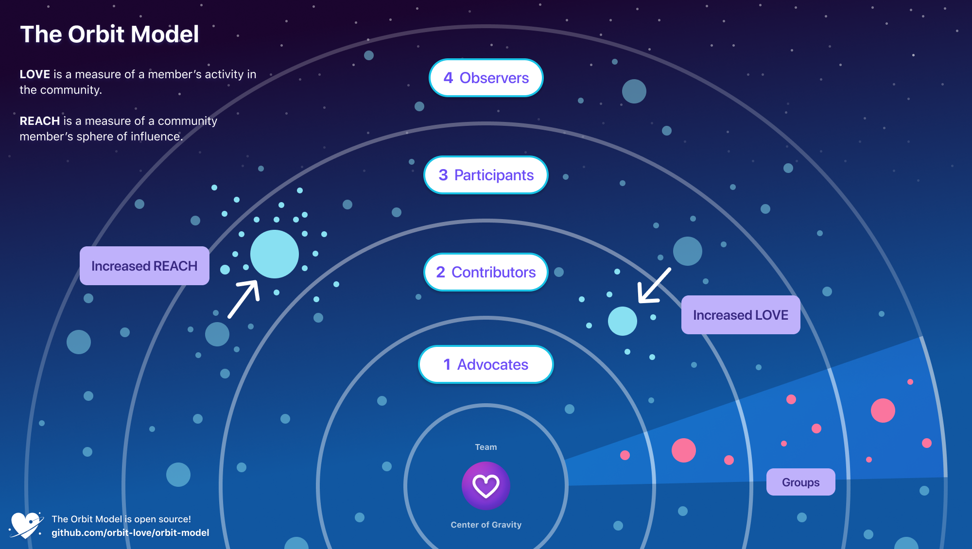
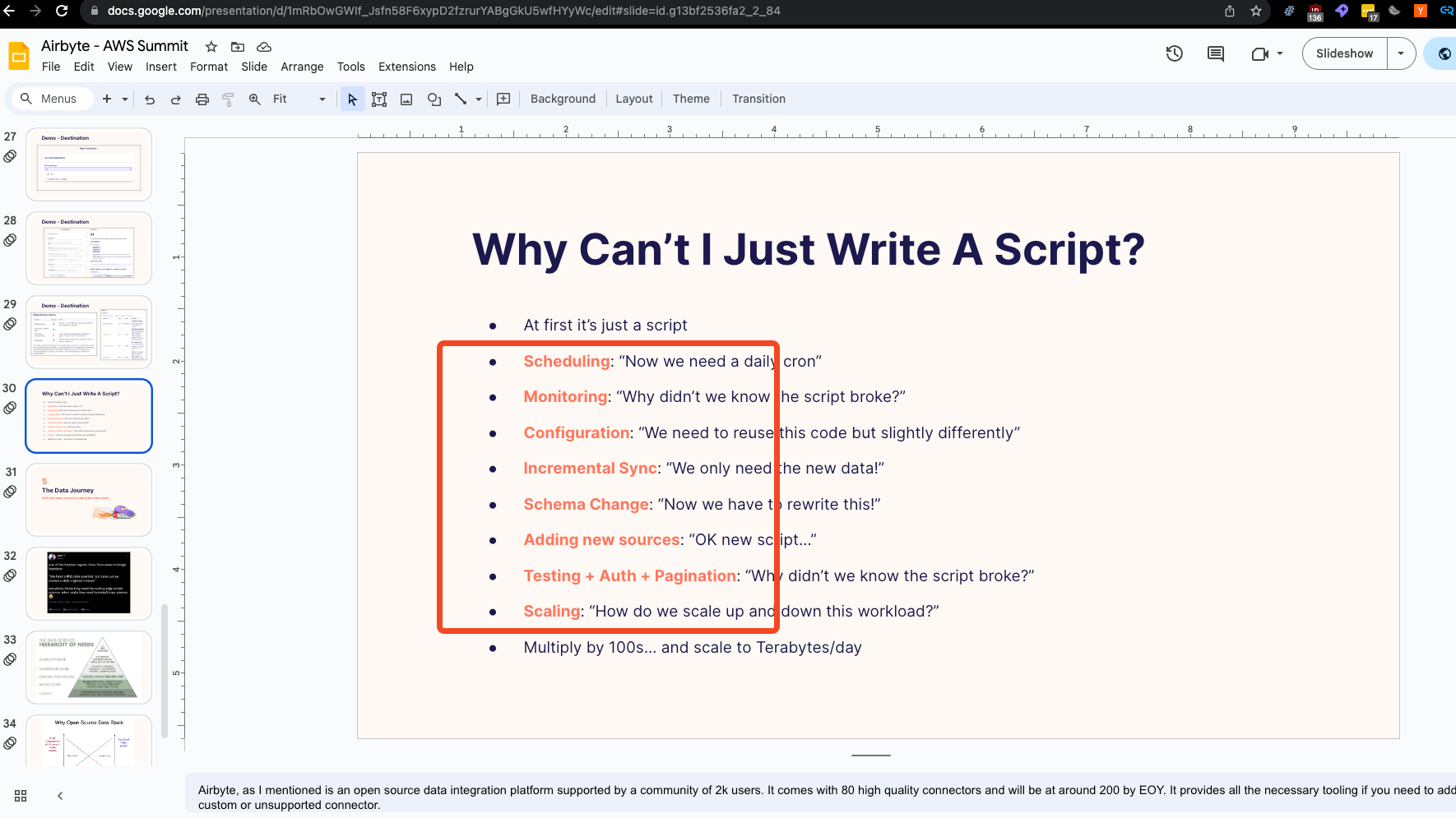
The Mental Framework
The Architecture
todo: find iconic architecture diagram that gives people aha moment
The Trajectory


Here just paying attention to what is growing and what is not leads the reader to the conclusion you are trying to draw them to.
The Timeline

Timelines are deceptive - they look objective, but are inherently subjective and suggestive of a message based on inclusion/exclusion criteria.
I used this in the Third Age of JavaScript.
The Taxonomy
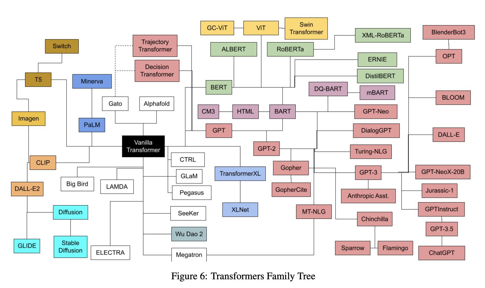
You can join timelines with Taxonomies:

The Hidden Imagery
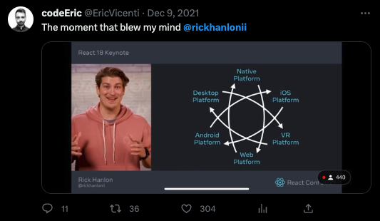
The "thing you're very used to seeing was secretly something else all along" is rare but very effective when the opportunity arises.
The Audience Positioning

I used this one in the Rise of the AI Engineer and in OSI Layers for Coding Careers. People like to know where they sit and be given clear language for how they differ from their peers.
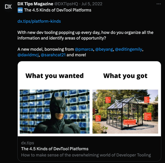
Memes
I've used that on this very magazine. Horizontal memes work better because of how these things tend to unfurl.
The Talk Map
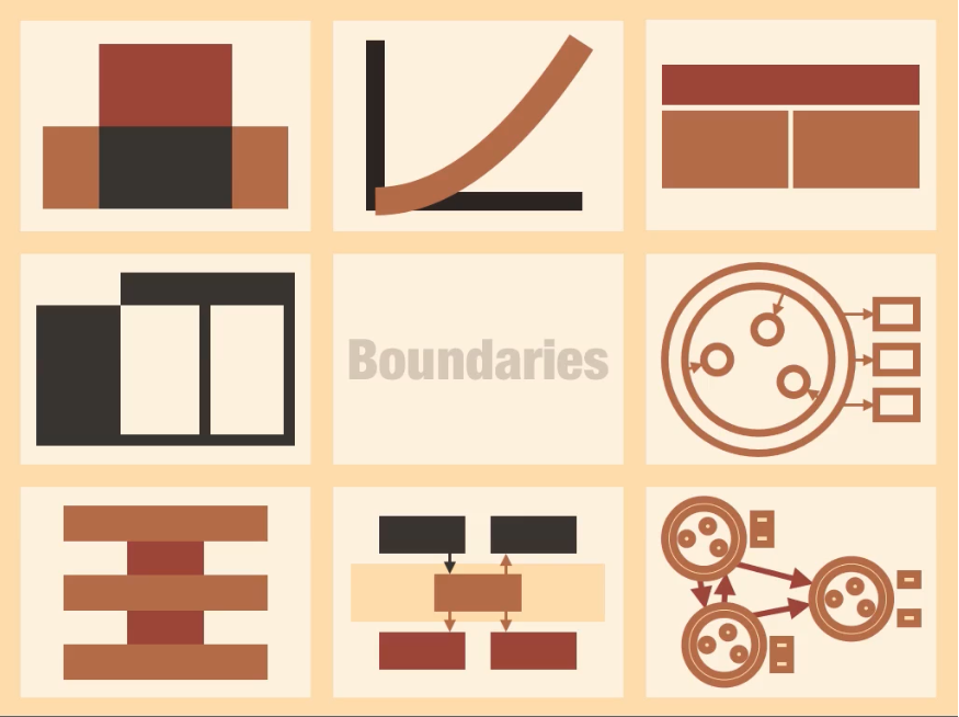
This one is mostly only useful for talks, so I leave it last.
Money Shots that No Longer Work
They are overused, just stop (doing them badly and expecting any reaction at all).
The God Box

The 2x2
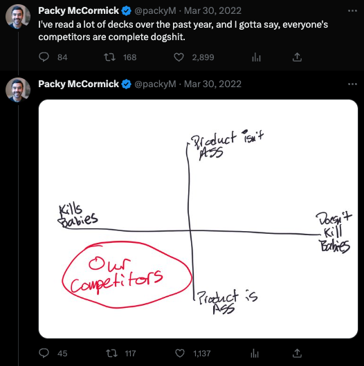
It's not hard to modify the 2x2 if you put a little more effort into it:

which directly inspired the one in 4.5 Kinds of Devtool Platforms and Radiating Circles of DX.
